

YouTube today announced a few changes coming to the company's mobile apps and desktop site, including a visual update for the well-known YouTube logo. Instead of emphasizing the "Tube" part of the branding, the new icon places the TV-like icon to the left of the company's name.
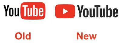
Designed for our multi-screen world, the updated Logo combines a cleaned up version of the YouTube wordmark and Icon, creating a more flexible design that works better across a variety of devices, even on the tiniest screens.
Why’s it more flexible? When room is limited (say on a smartphone) you can use the brightened up Icon as an abbreviated Logo, which will be seen more easily and read more clearly. You’ll see the new Logo and Icon roll out across mobile and desktop today, and across all our other apps and services soon.
Additionally, the company announced a few updates coming to its iOS and Android apps including improved navigation, more gesture controls (like swiping left and right to jump between videos in a playlist), the ability to speed up or slow down videos, and a dedicated player for vertical videos. There's also a new way to browse more videos while in the YouTube player, by swiping up from the bottom of the screen to see suggested videos.
Watch on YouTube































Top Rated Comments
Not suprised. Changing just for the sake of changing.
[doublepost=1504024264][/doublepost]That's what they want.
Take over the ISO/IEC 18035 ('https://en.m.wikipedia.org/w/index.php?title=ISO/IEC_18035&action=edit&redlink=1') symbol for the play function.
Sooner or later, you'll see kids saying "this old BluRay player has the YouTube button"