Apple Reveals Upcoming Liquid Glass Icons for Additional iOS Apps - MacRumorsOpen MenuShow RoundupsShow Forums menuVisit ForumsOpen Sidebar
Skip to Content

Apple Reveals Upcoming Liquid Glass Icons for Additional iOS Apps

Following Tuesday's event, new Liquid Glass icons for Apple Store, Clips, GarageBand, iMovie, Keynote, Numbers, and Pages have surfaced on Apple's iPhone tech spec pages. The new icons appear on the iPhone 16 tech specs page despite that model having no hardware changes, and existing users will presumably see the new icons in app updates that will roll out on Monday alongside iOS 26.
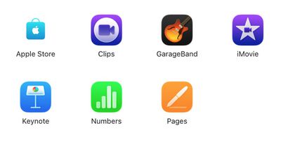
ios 26 other app icons‌iOS 26‌ icons

These apps come preinstalled on new iPhones but they were not included in the ‌iOS 26‌ betas and release candidate because they are updated through the App Store. While the spec sheets themselves don't reveal changes beyond the usual pre-installed and downloadable apps, the iconography is unmistakably updated to the latest iOS design set based around Liquid Glass.

Most of the updates are relatively subtle with changes largely limited to the glassiness of the design elements, while a few like Clips and GarageBand have a bit more substantial changes.
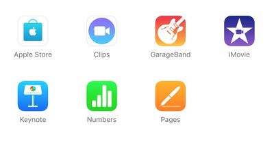
ios 18 other app iconsiOS 18 icons

Perhaps notably, there is inconsistency across Apple's product pages. While every iPhone model page displays these new icons, all Mac product pages continue to show the current macOS versions of these app icons.

We are not expecting Mac hardware updates until later this year, or more likely early 2026, but with macOS Tahoe being released alongside ‌iOS 26‌ on Monday, we should see the Liquid Glass app icons coming to Apple's ‌App Store‌ apps for Mac as well.

Related Roundups: iOS 26, iPadOS 26
Related Forum: iOS 26

Popular Stories

Jon Prosser Rainbow

YouTuber Jon Prosser Responds to Apple's Lawsuit Over iOS 26 Leaks

Thursday July 2, 2026 6:42 pm PDT by
Jon Prosser today responded to Apple's lawsuit over iOS 26 leaks, with the YouTuber placing much of the blame on his acquaintance Michael Ramacciotti. As a refresher, Apple sued Prosser and Ramacciotti in July 2025 over alleged theft of the company's trade secrets. Apple alleged that the duo coordinated to break into former Apple software engineer Ethan Lipnik's development iPhone, in order ...
iOS 26

Apple Seeds Fourth iOS 26.6 and iPadOS 26.6 Betas to Developers

Monday July 6, 2026 10:17 am PDT by
Apple today seeded the fourth betas of upcoming iOS 26.6 and iPadOS 26.6 updates to developers for testing purposes, with the software coming a week after Apple seeded the third betas. Registered developers can download the betas from the Settings app on the iPhone or iPad by going to the General section and selecting Software Update. With iOS 27 set to launch in September, Apple is...
iOS 26

Apple Seeds Fourth Public Betas of iOS 26.6, macOS Tahoe 26.6 and More

Tuesday July 7, 2026 1:16 pm PDT by
Apple today provided public beta testers with the fourth betas of iOS 26.6, iPadOS 26.6, macOS Tahoe 26.6, watchOS 26.6, and tvOS 26.6, with the software coming a day after Apple seeded the betas to developers. After signing up to beta test the software updates on Apple's beta site, public beta testers can download the new software using the Software Update section in the Settings app on...

Top Rated Comments

tomtad Avatar
12 months ago

I wish we would have transitioned to the icons used on Macs instead, they had some depth to them, and certain icons had elements that escaped the square.
liquid glass icons additional ios apps image

The delicious original Pages icon agrees
Score: 25 Votes (Like | Disagree)
RickDEGH Avatar
12 months ago
Those aren’t ’liquid glass’
Score: 20 Votes (Like | Disagree)
sleep/to/dream Avatar
12 months ago
That garageband logo… yikes

Edit: Does anybody else think the new icon designs are not 3D or glassy enough? They’re nowhere near as interesting to look at as the og iOS icons
Score: 17 Votes (Like | Disagree)
gleepskip Avatar
12 months ago
Apple's design language: anything goes.
Score: 16 Votes (Like | Disagree)
dontwalkhand Avatar
12 months ago
I wish we would have transitioned to the icons used on Macs instead, they had some depth to them, and certain icons had elements that escaped the square.
Score: 8 Votes (Like | Disagree)
12 months ago
although not as significant on icons , this looks like a clear downgrade in terms of legibility
Score: 8 Votes (Like | Disagree)

🔗 Related Apple News & Rumors

Stay updated with the latest Apple ecosystem news and verified rumors