Developer's Visual Comparison of macOS Catalina and Big Sur Offers Closer Look at Apple's UI Redesign for Macs - MacRumorsOpen MenuShow RoundupsShow Forums menuVisit ForumsOpen Sidebar
Skip to Content

Developer's Visual Comparison of macOS Catalina and Big Sur Offers Closer Look at Apple's UI Redesign for Macs

macOS 11 Big Sur is the next major release of Apple's operating system for Mac, and following its preview at WWDC, one of the biggest discussions has revolved around the all-new user interface redesign.

Andrew Denty
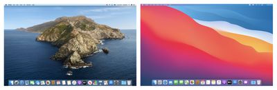
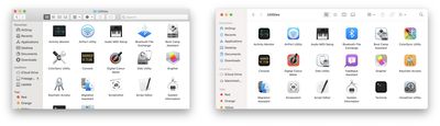
Developers are still learning what the impact the new UI will have on their apps, and with that in mind, app designer Andrew Denty has compiled an extensive visual comparison of the user interface changes between macOS Catalina and macOS Big Sur.

All of the screenshots are taken on a default install of macOS and the Catalina version is always on the left. I made a conscious effort not to resize any windows or change any default settings. I haven't captured everything, but it is a good taste of the changes so far.

The side-by-side comparisons cover changes to Finder, Preview, System Preferences, the menu bar, Notification Center, Safari, Calendar, Contacts, Reminders, Notes, Photos, Apple Music, Podcasts, and many other native apps.

Andrew Denty
Overall, Denty's takeaway is that the UI differences in Big Sur aren't as dramatic as he first thought, consisting of a "largely incremental set of changes to make macOS feel more coherent with iOS and iPad OS."

That said, he thinks Apple "still has a vast amount of work to do to perfect the new macOS UI" before it exits the beta, and he hopes to see more consistency in the launch experience of apps, as well as more visual separation in elements like status bars and path bars, which he admits "look a little unloved" and don't yet feel properly integrated.


Big Sur is available for developers at the current time, but Apple also plans to make a beta available for public beta testers in July, followed by an official release in the fall. What are your thoughts on the redesigned UI? Let us know in the comments below, and don't forget to check out our Big Sur roundup for an extensive look at all the new features.

Related Forums: macOS Catalina, macOS Big Sur

Popular Stories

HomePod mini and Apple TV Sage

New Apple TV and HomePod Mini Are 'Nearly Ready' to Launch, New Siri Remote Also Rumored

Sunday May 31, 2026 8:47 am PDT by
New models of the Apple TV 4K and HomePod mini are "nearly ready to go," according to the latest word from Bloomberg's Mark Gurman. Subscribe to the MacRumors YouTube channel for more videos. Both devices have been ready "for months," but Apple is holding off on launching them until the more personalized version of Siri is available, he said. "I am told the hardware for the next Apple TV...
iphone 17 pro black feature

iPhone 18 Pro's Camera Upgrade Will Cost Apple 50% More

Friday May 29, 2026 3:44 am PDT by
The iPhone 18 Pro and iPhone 18 Pro Max's all-new variable aperture lens will cost Apple 50% more than the camera unit used in current models, according to supply chain analyst Ming-Chi Kuo. Variable aperture has been one of the most persistent iPhone camera rumors of the past few years. Kuo first flagged the feature in late 2024, and it has since been corroborated by multiple reports and...
iphone 18 pro color dummies

First Look at iPhone 18 Pro Color Options Revealed by Dummy Models

Friday May 29, 2026 4:50 am PDT by
Leaker Sonny Dickson today shared images of iPhone 18 Pro dummy models in the device's four rumored colors, offering the first real-world look at what to expect from the lineup visually. Corroborating previous rumors, the dummies show the iPhone 18 Pro Max in Light Blue, Black, Silver, and Dark Cherry. Dickson said "Cherry will probably be the next hit, orange did very well." Cosmic Orange...

Top Rated Comments

77 months ago
Deleted.
Score: 64 Votes (Like | Disagree)
backslash-f Avatar
77 months ago
I'm currently using it and I'm in love with it.


It feels fresh and I had no big issues so far. Some UI glitches here and there but that's all.

Attachment Image
Score: 25 Votes (Like | Disagree)
77 months ago

It is the infantilization of software, making it appeal to kids rather than adults. Candification, with transparency and effects using the combined wattage of a medium nuclear power plant. Duolingofication, just plain silly.
Quite the contrary, it looks fantastic. This refresh is long overdue. Very excited to get it.
Score: 20 Votes (Like | Disagree)
PickUrPoison Avatar
77 months ago

Is it stable enough to be installed on my corporate machine?
K.
A developer beta? Ummmm sure. Roll that puppy out to the production machines. That’s what your corporate IT department recommended, right? 🤣
Score: 17 Votes (Like | Disagree)
macdos Avatar
77 months ago
It is the infantilization of software, making it appeal to kids rather than adults. Candification, with transparency and effects using the combined wattage of a medium nuclear power plant. Duolingofication, just plain silly.
Score: 16 Votes (Like | Disagree)
77 months ago
The only thing that bothers me about the redesign is lack of contrast for controls/buttons.

I always remove all apps from Dock after installing macOS so don't really care about the icons much (and like most of them anyway).


Question for anyone with the preview: can you right click on the window name in Finder to get access to the folder hierarchy or is that completely gone now?
You can still do that:


Attachment Image
Score: 14 Votes (Like | Disagree)

🔗 Related Apple News & Rumors

Stay updated with the latest Apple ecosystem news and verified rumors