Apple Shares Liquid Glass Design Gallery - MacRumorsOpen MenuShow RoundupsShow Forums menuVisit ForumsOpen Sidebar
Skip to Content

Apple Shares Liquid Glass Design Gallery

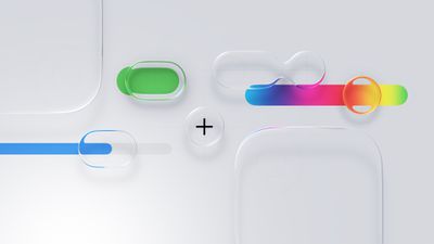
Apple is promoting the new Liquid Glass design in iOS 26, showing off the ways that third-party developers are embracing the aesthetic in their apps. On its developer website, Apple is featuring a visual gallery that demonstrates how "teams of all sizes" are creating Liquid Glass experiences.
Liquid Glass General Feature
The gallery features examples of Liquid Glass in apps for iPhone, iPad, Apple Watch, and Mac. Apple includes comparisons of how each app looked in iOS 18, and how it looks in ‌iOS 26‌.

Apple's examples feature apps that have eliminated bottom navigation bars in favor of smaller navigation options, apps with Liquid Glass sliders and buttons, and apps using popovers.

Featured apps include Crumbl, Tide Guide, GrowPal, Lumy, Sky Guide, Linearity Curve Graphic Design, LTK, American Airlines, Lowe's, Photoroom, OmniFocus 4, CNN, Essayist, and Lucid Motors.

The design comparisons are best viewed on Apple's site, and are worth checking out if you're curious about how third-party apps are incorporating Liquid Glass.
Popular Stories

Apple Event Logo

Apple Working on All-New Operating System

Wednesday July 29, 2026 11:39 am PDT by
Apple is developing an all-new operating system that is essentially a mix of tvOS, watchOS, and iOS, according to Bloomberg's Mark Gurman. In a report this week, he said the operating system will feature a grid of icons, widgets, and apps, along with customizable clock faces. The new software platform is intended for Apple's long-rumored smart home hub. With built-in facial recognition,...
imac video apple feature

Apple Made Its Second-Biggest Acquisition Ever This Year

Wednesday July 29, 2026 12:03 pm PDT by
Apple this year acquired Israeli startup Q.ai for close to $2 billion, according to the Financial Times. That would make this Apple's second-biggest acquisition ever, after it paid $3 billion for the popular headphone maker Beats in 2014. This is also the largest known Apple acquisition since the company purchased Intel's smartphone modem business and patents for $1 billion in 2019. Q.ai...
Dynamic Island iPhone 18 Pro Feature

iPhone 18 Pro: Twelve Changes Coming to Apple's Next Flagship

Thursday July 30, 2026 3:43 am PDT by
We're less than two months out from the launch of Apple's premium next-generation smartphone lineup, and while we're not expecting a dramatic change in terms of functionality, there are still several enhancements rumored to be coming to the iPhone 18 Pro and iPhone 18 Pro Max. One thing worth noting is that Apple is reportedly planning a major change to its iPhone release cycle this year,...

Top Rated Comments

10 months ago
iOS 18 is so much cleaner.

This comparison makes it so obvious liquid glass adds nothing of value to the UX.
Score: 62 Votes (Like | Disagree)
iZac Avatar
10 months ago
Ahh, am I just a curmudgeon? For the most part prefer the left-hand screenshots because they're less 'noisy' - a clear interaction zone with the icons. The right-hand animations are mostly floating, transparent lozenges. They visually flicker and are intermittently illegible.
Score: 52 Votes (Like | Disagree)
klasma Avatar
10 months ago
I looked at all examples in the gallery, and the usability degradation just makes me sad. Hopefully Apple will realize at some point that this isn’t a good design for people who just want to get 💩 done on their devices.
Score: 43 Votes (Like | Disagree)
jchap Avatar
10 months ago
I wonder if these app developers can categorically say that incorporating Liquid Glass into their designs has made their apps better, easier to use, and more user-friendly, or just looking different…
Score: 33 Votes (Like | Disagree)
10 months ago
I actually really love Liquid Glass. I can understand why people may not. But you cannot please everyone. I also think too many people listen to tech YouTubers.
Score: 31 Votes (Like | Disagree)
midkay Avatar
10 months ago
I'm loving Liquid Glass more everyday. It just looks so refined and the refraction effects add so much visual interest compared to the "flat" textureless designs from the decade before.

The CNN comparison is a great example to me:


It's really nice to see the photos at the bottom extend fully downwards, bringing more color and life to the screen, rather than that large flat gray bar. A lot of people may argue this is not 100% "useful" or "necessary", but that's not the point. It looks and feels much nicer.

Attachment Image
Score: 28 Votes (Like | Disagree)

🔗 Related Apple News & Rumors

Stay updated with the latest Apple ecosystem news and verified rumors