Gmail to Get New Icon as Part of G Suite Rebranding - MacRumorsOpen MenuShow RoundupsShow Forums menuVisit ForumsOpen Sidebar
Skip to Content

Gmail to Get New Icon as Part of G Suite Rebranding

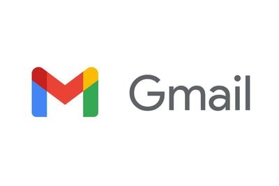
The Gmail app is set to get a new icon as part of a broader rebrand of Google's G Suite software, which includes Gmail, Docs, Meet, Sheets, and Calendar.
newgmaillogo
Replacing the classic Gmail envelope logo is an M made out of Google's blue, red, yellow, and green brand colors. The new design aligns Gmail with Google's core brand as well as Google Maps, Google Photos, Google Chrome, and other Google products.

According to Fast Company, Google considered dropping the M altogether or fully removing the red color from the Gmail icon, but user research studies showed that people weren't happy with those changes.


Google has also redesigned its Calendar, Docs, Meet, and Sheets logos to match the new Gmail design, while G Suite has become "Google Workspace" in an attempt to merge Gmail, Chat, and Docs into a more integrated whole.
Tags: Gmail, Google

Popular Stories

google pixel 10 fold 1

Google's Pixel 11 Event Set for August 12, a Month Before Apple Debuts Foldable iPhone

Tuesday July 7, 2026 11:48 am PDT by
Google will introduce its latest Pixel smartphones at an August 12 event, debuting the updated devices about a month ahead of when Apple is expected to announce new iPhone models. Google is expected to launch the Pixel 11, Pixel 11 Pro, Pixel 11 Pro XL, and a new Pixel 11 Pro Fold. Leaked CAD renders suggest the new smartphones will have slimmed down bezels, a slightly thinner design than...
Chrome Feature 22

Google Chrome's Gemini AI Features Roll Out to UK Users

Tuesday July 14, 2026 2:32 am PDT by
Google has announced the rollout of Chrome's latest AI features to Mac and PC users in the U.K., indicated by a new "Ask Gemini" button with a sparkle icon in the upper right side of the browser. Gemini in Chrome can work across multiple tabs, which is supposed to make it useful for comparing and summarizing information from several websites at once. It also integrates with Google...
Google Logo Feature Slack

Google and Epic Abandon Injunction Modification Request, Clearing the Way for Rival Android App Stores

Wednesday July 15, 2026 5:02 pm PDT by
Google and Epic Games this week withdrew their joint motion to modify an injunction requiring Google to support third-party app stores in Google Play. The two companies abandoned the request after it became clear the court was unlikely to allow it. Google is now bound by a permanent injunction issued in October 2024 requiring it to allow alternative app stores on Android devices. In a court...

Top Rated Comments

76 months ago

How cares? Why not spend the resources on making the apps better?
I'm sure Google has both software engineers and designers on permanent staff, so this probably had a near-zero impact on app development.

Now, we can argue whether the designers' time couldn't have been spent better on other problems, but it's not like they asked developers to quit Xcode or Visual Studio and fire up Photoshop.
Score: 15 Votes (Like | Disagree)
yurc Avatar
76 months ago
Historically Google icons and their interface are sort of identity crisis. They had quite a lot numerous changes.
Score: 11 Votes (Like | Disagree)
76 months ago
White backgrounds on iOS icons look awful

Google Maps icon change was awful.
Score: 10 Votes (Like | Disagree)
76 months ago

They have too many employees when they make a fuss of such tiny ****. Doing a video for a logo change. Who the hell cares?!
Logos are the "face" of a brand, and GMail is one of the most popular web services out there. It's pretty much a bliion dollar brand of its own.

Compared with the effort Apple goes to when it comes to showcasing things like the design of the Apple Card ('//www.youtube.com/watch?v=JLE228ZuGGA'), Google's little animation looks positively modest.
Score: 9 Votes (Like | Disagree)
Mdracer Avatar
76 months ago
Again, Google rebrands and re-icons it’s apps. They seem to have a hydra problem. Once one app is gone... 7 more appear.
Score: 6 Votes (Like | Disagree)
Juicy Box Avatar
76 months ago

but user research studies showed that people weren't happy with those changes.
Studies on icons?
I guess it is nice that they are listening to their users, but I didn't realize that so much went into icon decisions.
Score: 6 Votes (Like | Disagree)

🔗 Related Apple News & Rumors

Stay updated with the latest Apple ecosystem news and verified rumors