Google Maps developers yesterday introduced some visual changes and subtle navigation aids for both desktop and iOS that aim to make it easier for users to explore the world around them.
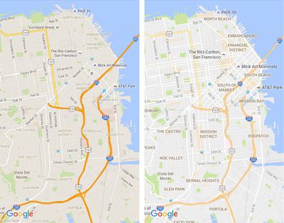
The most immediately obvious visual changes include the removal of road outlines to make traffic and transit routes easier to delineate, as well as clearer typography for street names, points of interest, transit stations, and so on, making them more distinguishable.
Another, less obvious but significant change is the way Google Maps represents high density areas of interest – restaurants, bars, shops, and so on – which now appear as orange shaded hotspots on the map. As the video above demonstrates, zooming into an orange area brings more details into focus, allowing users to tap them for more information.
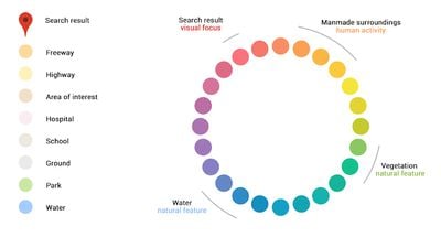
The new Maps also gains a more subtle and balanced color scheme to help users differentiate between man-made and natural topographic features, as well as identify places like hospitals, schools and highways more easily.
Google Maps is a free download for iPhone and iPad available on the App Store. [Direct Link]
Looking... hmm, OK. With reservations for how this looks in daylight.
At first glance I thought they had just lowered contrast by brightening everything and bringing earlier bold colors to be more pastel like, which would be a bad thing since low contrast sucks especially in daylight.
However, due to how ridiculously poor contrast streets already were (mid grey with a hint of warmth against a little bit darker grey), I think the new style (light grey against white) is slightly better although clearly not perfect if in broad daylight.
The highway above is now more pastel like which I don't think matters too much because it still clearly stands out thanks to its deviating color. This also helps bring attention to route numbers and the district names that are all given better attention.
Still, this is one pastel like map. It seems like Google is shooting for a 50/50 split between style and usability. I'd prefer a bolder move there, 30/70? These maps are, after all, heavily used outdoors and then bright pastel colors are far from optimal.
Another idea is if Google Maps (and Apple Maps?) would have a switch to enable bolder colors. That would help a lot sometimes. Here's an example from the Swedish Eniro service which I think has a map much more tuned towards actual use: http://i.imgur.com/FhYn5ov.jpg (sorry for JPG on what should have been a PNG; Imgur is being stupid)
Looking... hmm, OK. With reservations for how this looks in daylight.
At first glance I thought they had just lowered contrast by brightening everything and bringing earlier bold colors to be more pastel like, which would be a bad thing since low contrast sucks especially in daylight.
However, due to how ridiculously poor contrast streets already were (mid grey with a hint of warmth against a little bit darker grey), I think the new style (light grey against white) is slightly better although clearly not perfect if in broad daylight.
The highway above is now more pastel like which I don't think matters too much because it still clearly stands out thanks to its deviating color. This also helps bring attention to route numbers and the district names that are all given better attention.
Still, this is one pastel like map. It seems like Google is shooting for a 50/50 split between style and usability. I'd prefer a bolder move there, 30/70? These maps are, after all, heavily used outdoors and then bright pastel colors are far from optimal.
Another idea is if Google Maps (and Apple Maps?) would have a switch to enable bolder colors. That would help a lot sometimes. Here's an example from the Swedish Eniro service which I think has a map much more tuned towards actual use: http://i.imgur.com/FhYn5ov.jpg (sorry for JPG on what should have been a PNG; Imgur is being stupid)
Agree 100%
Back in the day I used a custom color scheme with my TomTom that was similar to the Swedish one you linked too.
Contrast and usability should always trump style, especially at 80mph.
I guarantee a color scheme like GMap's latest would never be installed in an F-35. [doublepost=1469533382][/doublepost]
I don't care about Google Maps because I don't use them but I will reply because some comments here are about Apple Maps.
Readability issue should be solved with hardware. Screen should be bright enough to work on the sunlight. Apple moves toward this goal. Compare iPhone 6 and 5. I don't think different contrast would perform better on the sunlight. When you are using bad screen, like Nintendo 3DS for example, it is impossible to see what's on it, no matter what game are you playing.
Bad idea. Adding a switch is easy but it is bloating UI, makes it more dangerous because you now need to think about this switch and you need to manage it. It also makes it more complicated and most people will don't understand it. I saw people having troubles navigation because the've been using car navigation when walking. Adding one more switch will not make things better.
This Swedish map makes me want to puke. I am using maps almost every day and if I would have to use this, I would become depressed in a week. Design is not just for prettiness, it affects our mood and perception.
Dear Lord what is going on with our millennials?
Depressed? Mood?
Holy...
Dude at 80mph I don't give a flying about your mood. I'm trying to navigate safely at high speed. Shove your feels.
I always thought Apple Maps looked a little out of place at first (with its colour tones), but now Google Maps have just done exactly that too. Makes sense, but still.
I like the new design. And either way - everything Google Maps offers is still LIGHT YEARS ahead of the Apple Maps.
Yup, Google Maps (and its search engine and other apps) are way ahead of Apple in tracking you. It is the best mapping app for people who don't care about their privacy. ;)
Friday September 25, 2026 8:16 am PDT by Joe Rossignol
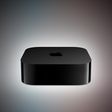
MacRumors contributor Aaron Perris has uncovered an image file from Apple for an unreleased Apple TV 4K, suggesting that a new model will finally be released soon. The image is specifically for an "Apple TV 4K (4th generation)" model.
Apple TV 4K (4th generation) image (on a gradient)
The image reveals that the Apple TV will have the same external design as the current model, with all of its...
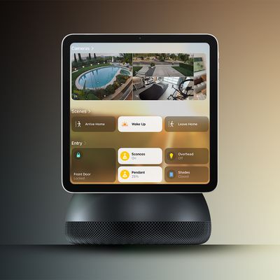
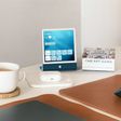
Apple's long-rumored smart home hub will have an iMac G4-style design and a host of unique features, Bloomberg's Mark Gurman reports.
The smart home hub is said to feature a square 6-inch display, with variants that can be placed on a countertop or mounted on a wall. It features a single FaceTime camera on the front, with microphones and speakers in its connected base. Gurman described the...
Apple plans to introduce a series of new smart home products on Tuesday, October 13, according to Bloomberg's Mark Gurman.
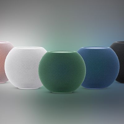
Apple reportedly plans to debut its long-awaited smart home hub device, a new HomePod mini, and a new Apple TV on the date. The new HomePod mini and Apple TV are set to retain their existing designs, but tout faster chips to support Siri AI. The new HomePod mini will...
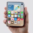
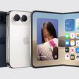
Apple's first foldable iPhone, with a book-style design featuring a 5.4-inch outer display and a 7.6-inch inner display with a minimal crease down the middle.


 The new Maps also gains a more subtle and balanced color scheme to help users differentiate between man-made and natural topographic features, as well as identify places like hospitals, schools and highways more easily.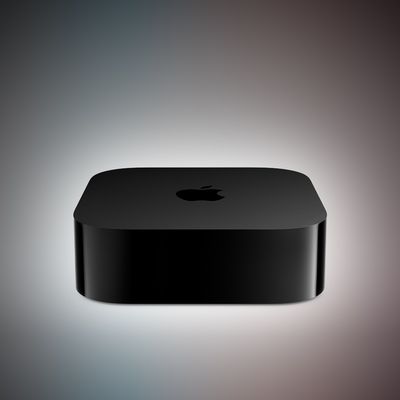
































Top Rated Comments
At first glance I thought they had just lowered contrast by brightening everything and bringing earlier bold colors to be more pastel like, which would be a bad thing since low contrast sucks especially in daylight.
However, due to how ridiculously poor contrast streets already were (mid grey with a hint of warmth against a little bit darker grey), I think the new style (light grey against white) is slightly better although clearly not perfect if in broad daylight.
The highway above is now more pastel like which I don't think matters too much because it still clearly stands out thanks to its deviating color. This also helps bring attention to route numbers and the district names that are all given better attention.
Still, this is one pastel like map. It seems like Google is shooting for a 50/50 split between style and usability. I'd prefer a bolder move there, 30/70? These maps are, after all, heavily used outdoors and then bright pastel colors are far from optimal.
Another idea is if Google Maps (and Apple Maps?) would have a switch to enable bolder colors. That would help a lot sometimes. Here's an example from the Swedish Eniro service which I think has a map much more tuned towards actual use: http://i.imgur.com/FhYn5ov.jpg (sorry for JPG on what should have been a PNG; Imgur is being stupid)
Back in the day I used a custom color scheme with my TomTom that was similar to the Swedish one you linked too.
Contrast and usability should always trump style, especially at 80mph.
I guarantee a color scheme like GMap's latest would never be installed in an F-35.
[doublepost=1469533382][/doublepost]Dear Lord what is going on with our millennials?
Depressed? Mood?
Holy...
Dude at 80mph I don't give a flying about your mood. I'm trying to navigate safely at high speed. Shove your feels.